Zindi UberCT Part 3: Uber Movement
Uber Movement has launched in Cape Town
Today, Uber Movement launched in Cape Town. This is good news, since it means more data we can use in the ongoing Zindi competition I’ve been writing about! In this post we’ll look at how to get the data from Uber, and then we’ll add it to the model from Part 2 and see if it has allowed us to make better predictions. Unlike the previous posts, I won’t be sharing a full notebook to accompany this post - you’ll have to do the work yourself. That said, if anyone is having difficulties with anything mentioned here, feel free to reach out and I’ll try to help. So, let’s get going!
Getting the data
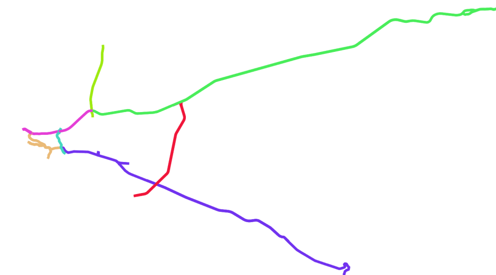
My rough travel ‘zones’
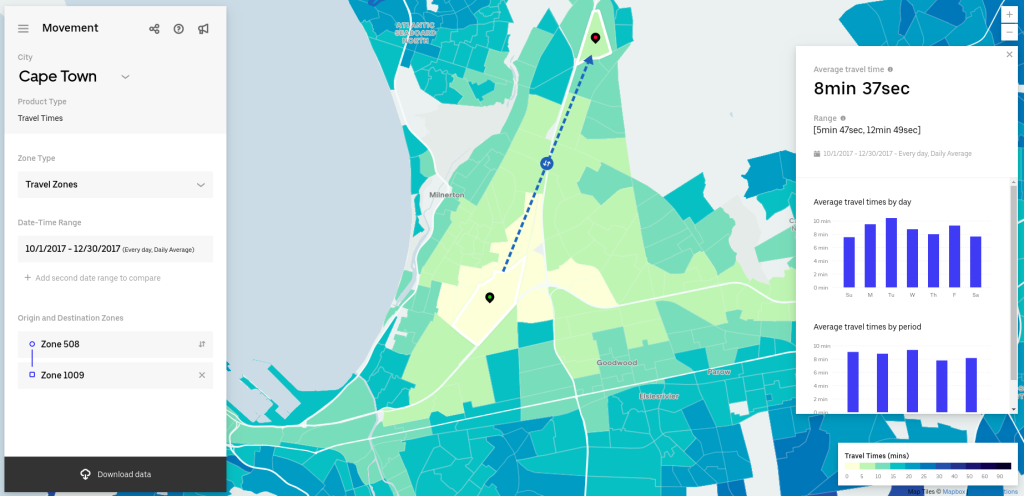
Zindi provided some aggregated data from Uber movement at the start of the competition. This allows you to get the average travel time for a route, but not to see the daily travel times (it’s broken down by quarter). But on the Uber Movement site, you can specify a start and end location and get up to three months of daily average travel times. This is what we’ll be using.
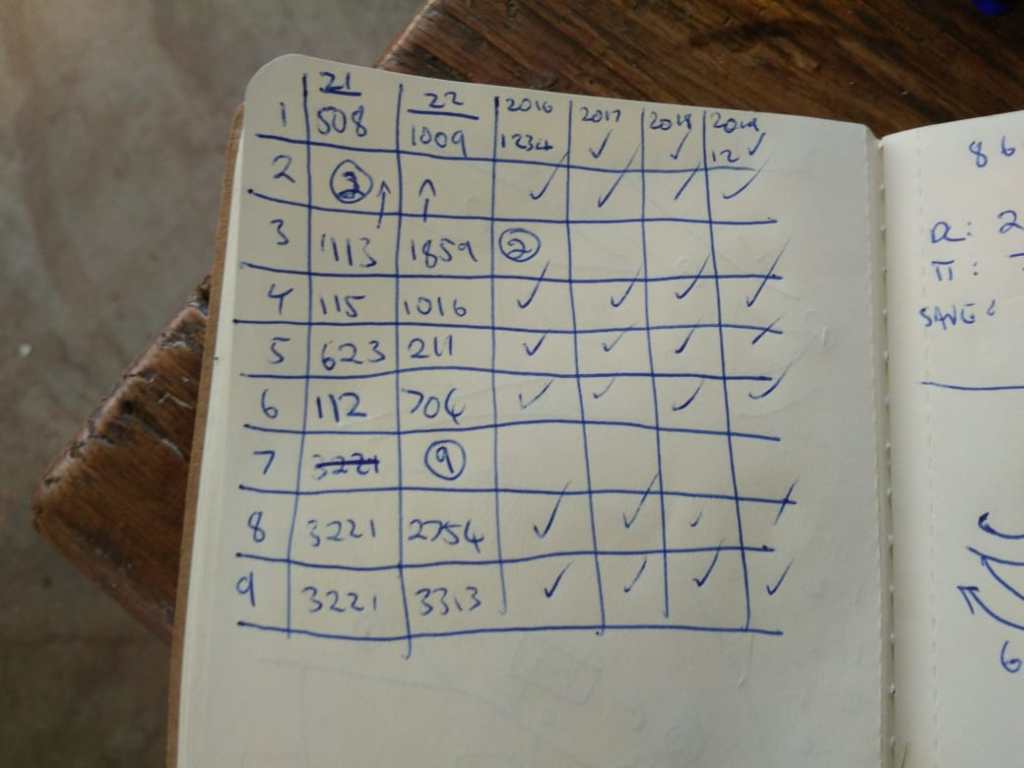
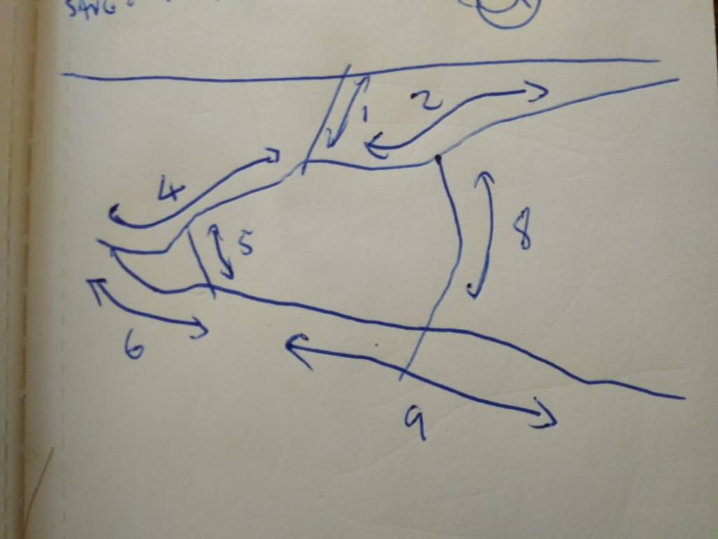
Using sophisticated mapping software (see above), I planned 7 routes that would cover most of the road segments. For each route, I chose a start and end zone in the Uber Movement interface (see table above) and then I downloaded the data. To do it manually would have taken ages, and I’m lazy, so I automated the process using pyautogui, but you could also just resign yourself to a few hours of clicking away and get everything you need. More routes here would have meant better data, but this seemed enough to give me a rough traffic proxy.
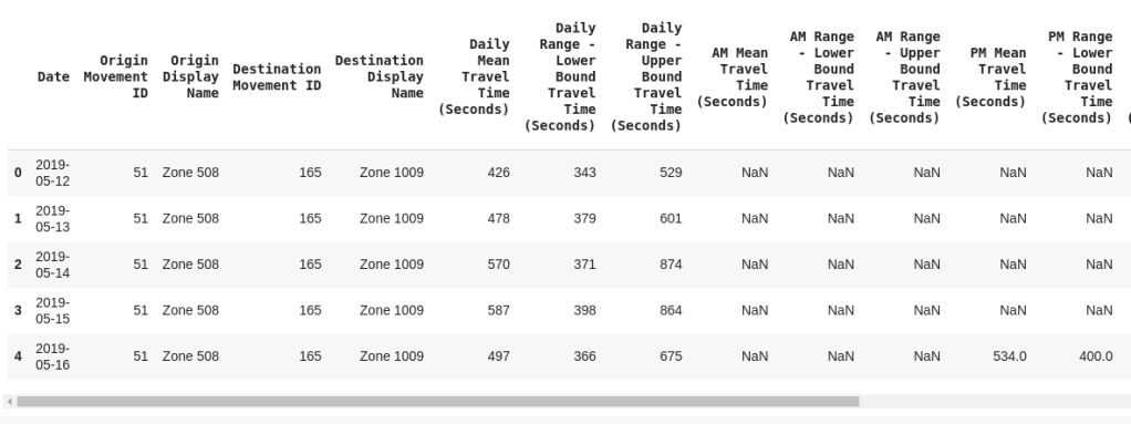
Some of the travel times data
I manually tagged each segment with the equivalent Uber Movement trip I would be using to quantify traffic in that area, using QGIS. This let me link this ‘zone id’ from the segments shapefile to my main training data, and subsequently merge in the Uber Movement travel times based on zone id and datetime.
Does it work?
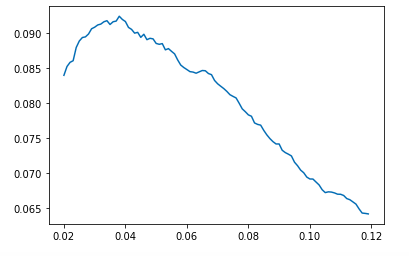
Score (y axis) vs threshold for predicting a 1. In my case, a threshold of ~0.35 was good.
In the previous post, the F1 score on my test set was about 0.082. This time around, without anything changed except the addition of the Uber data, the score rises above 0.09. Zindi score: 0.0897. This is better than an equivalent model did without the uber movement data, but it’s still not quite at the top - for that a little more tweaking will be needed :)
I’m sorry that this post is shorter than the others - it was written entirely in the time I spent waiting for data to load or models to fit, and is more of a show-and-tell than a tutorial. That said, I hope that I have achieved my main goal: showing that the Uber Movement data is a VERY useful input for this challenge, and giving a hint or two about where to start playing with it.
(PS: This model STILL ignores all of the SANRAL data. Steal these ideas and add that in, and you’re in for a treat. If you do this, please let me know? Good luck!)